16. The IRMT Data Viewer
The IRMT Data Viewer is a dock window added to QGIS by the IRMT plugin, used for data visualization. It is shown/hidden by pressing the button Toggle IRMT Data Viewer.
In its initial state, the window displays a Output Type selector, that enables to trigger the visualization of different types of data, and an initially empty plotting area.
The viewer can plot some of the outputs produced by the OpenQuake Engine, such as hazard curves and uniform hazard spectra, and recovery curves (see also Definitions and acronyms).
When a layer containing compatible data is activated in the QGIS and the corresponding output type is selected, the viewer is ready to visualize the outputs corresponding to the features that will be selected in the map.
Plots are obtained using the Matplotlib library. Below the plotting area, Matplotlib provides a toolbox with standard functionalities that enable modifying markers, labels, axes, zooming level and other parameters, saving the plot to file and exporting the selected curves into a csv format.
16.1. Visualizing hazard curves
A hazard curve defines the relation between a scalar IML and the probability of at least one exceedance of that IML within a time span T. The OpenQuake-engine computes discrete hazard curves described by a two-dimensional array containing a first column of n values of an IMT and a second column including values of the probability of exceedance of the resultant IML in the time span T (which is indicated in the OpenQuake-engine configuration file). A hazard curve is the primary result of a PSHA analysis for a particular site. From hazard curves it is possible to compute other result-typologies such as hazard maps and uniform hazard spectra.
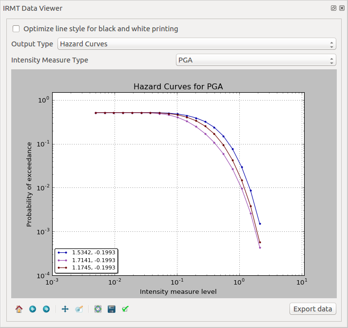
As described in Driving the OpenQuake Engine, the plugin enables to run hazard calculations and to download the corresponding outputs. For outputs of type hcurves, it is possible to load the data into a QGIS layer by pressing the button Load npz as layer. The layer will contain, for each point, the set of intensity measure levels and the corresponding values of probability of exceedance, for each of the available intensity measure types. While the layer is active, it is possible to select the Output Type Hazard Curves, to activate the visualization. When one or more points are selected in the map, the hazard curves for the chosen Intensity Measure Type are plotted together (Fig. 16.1). The legend also specifies the longitude and latitude of the points corresponding to each of the curves in the plot. By hovering on the legend items or on the curves, the corresponding points in the map are highlighted.
Warning
The highlighting effect produced by hovering with the mouse on legend items or curves, stops working correctly when a layer is loaded using the OpenLayers Plugin. Please note that, starting from QGIS 2.18, base maps can be added as layers without installing any external plugin (such as OpenLayers), but using the new core functionality XYZ driver instead. In order to do so, you have to open the Browser Panel, right-click on the Tile Server (XYZ) and select New connection.... Then, for instance, to add a connection to OpenStreetMap, you can insert into the text box the following string: http://tile.openstreetmap.org/{z}/{x}/{y}.png. Then press Ok and insert a name for the tile layer (e.g., OpenStreetMap). Afterwards, it is sufficient to double-click on the new item you have just created, to add OpenStreetMap to the Layers Panel and to visualize it in the map canvas.
16.2. Visualizing uniform hazard spectra
A Uniform Hazard Spectrum (UHS) is a typology of result that is site-specific – as in the case of hazard curves. A UHS defines a relationship between the period (or frequency) of a period-dependent (or frequency-dependent) IMT such as spectral acceleration and the resulting IMT value with a fixed probability of exceedance in a time span T.
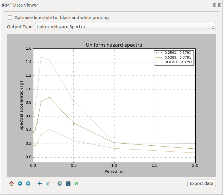
The workflow to visualize uniform hazard spectra is almost the same as the one described above for visualizing hazard curves. In this case, the Output Type to be loaded as layer is Uniform Hazard Spectra (Fig. 16.2).
16.3. Visualizing recovery curves
Please refer to Post-Earthquake Recovery Modelling Methodology for a general overview of the recovery modeling workflow, its scientific background and the description of the parameters and of the configuration files.
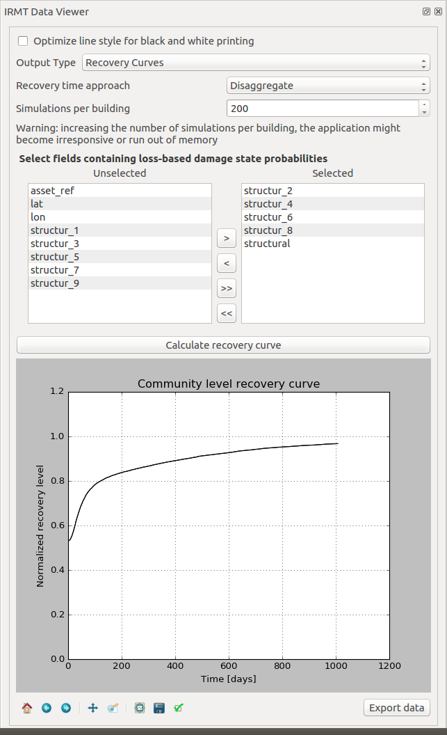
When one point is selected in the map, the corresponding building-level recovery curve is plotted. By selecting two or more points, the corresponding community-level recovery curve is displayed.
The selection can be made by clicking points directly in the map, or by leveraging other selection tools available in QGIS. For instance, it might be useful to select buildings that share a specific taxonomy. In order to do so, it is sufficient to click the Select features using an expression button in the QGIS toolbar, and to use the expression editor to perform the desired query. A useful example could be an expression such as: “taxonomy” LIKE ‘LC-%’, that would select all those features for which the taxonomy field begins with the string “LC-“, i.e., all “low building code” assets.


