15. The IRMT Data Viewer
The IRMT Data Viewer is a dock window added to QGIS by the IRMT plugin, used for data visualization. It is shown/hidden by pressing the button Toggle IRMT Data Viewer.
In its initial state, the window displays a Output Type selector, that enables to trigger the visualization of different types of data, and an empty plotting area.
At the time of this writing, the viewer can plot some of the outputs produced by the OpenQuake Engine, such as hazard curves and uniform hazard spectra, and recovery curves.
When a layer containing compatible data is activated in the QGIS and the corresponding output type is selected, the viewer is ready to visualize the outputs corresponding to the features that will be selected on the map.
15.1. Visualizing hazard curves
As described in Driving the OpenQuake Engine, the plugin enables to run hazard calculations and to download the corresponding outputs. For outputs of type hcurves, it is possible to load the data into a QGIS layer by pressing the button Load npz as layer. The layer will contain, for each point, the set of intensity measure levels and the corresponding values of probability of exceedance, for each of the available intensity measure types.
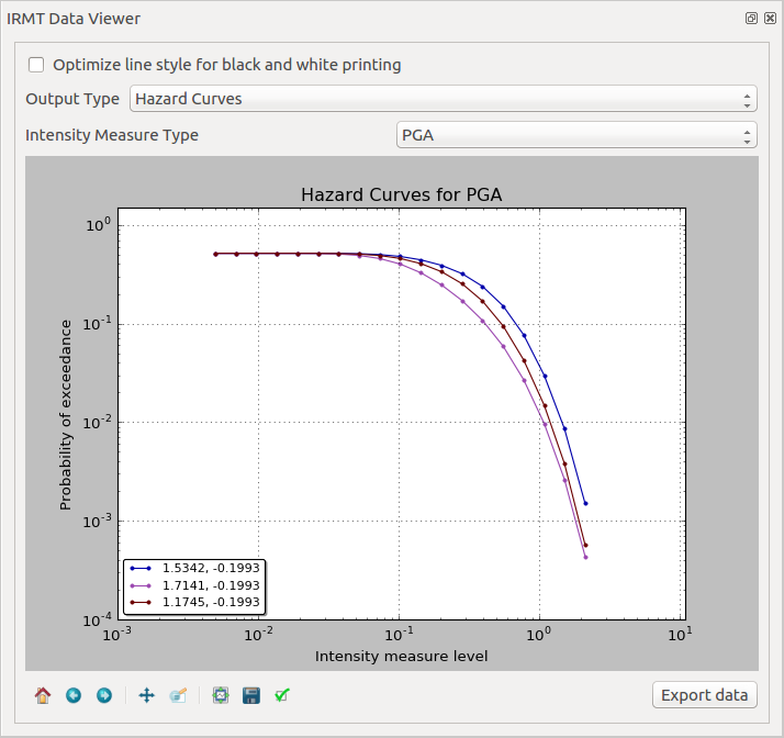
While the layer is active, it is possible to select the Output Type Hazard Curves, to activate the visualization. When one or more points are selected in the map, the hazard curves for the chosen Intensity Measure Type are plotted together (Fig. 15.1). The legend also specifies the longitude and latitude of the points corresponding to each of the curves in the plot. By hovering on the legend items or on the curves, the corresponding points in the map are highlighted.
15.2. Visualizing uniform hazard spectra
The workflow to visualize uniform hazard spectra is almost the same as the one described above for visualizing hazard curves. In this case, the output type to be loaded as layer is uhs.
15.3. Visualizing recovery curves
Please refer to Post-Earthquake Recovery Modelling Methodology for a general overview of the recovery modeling workflow, its scientific background and the description of the parameters and of the configuration files.
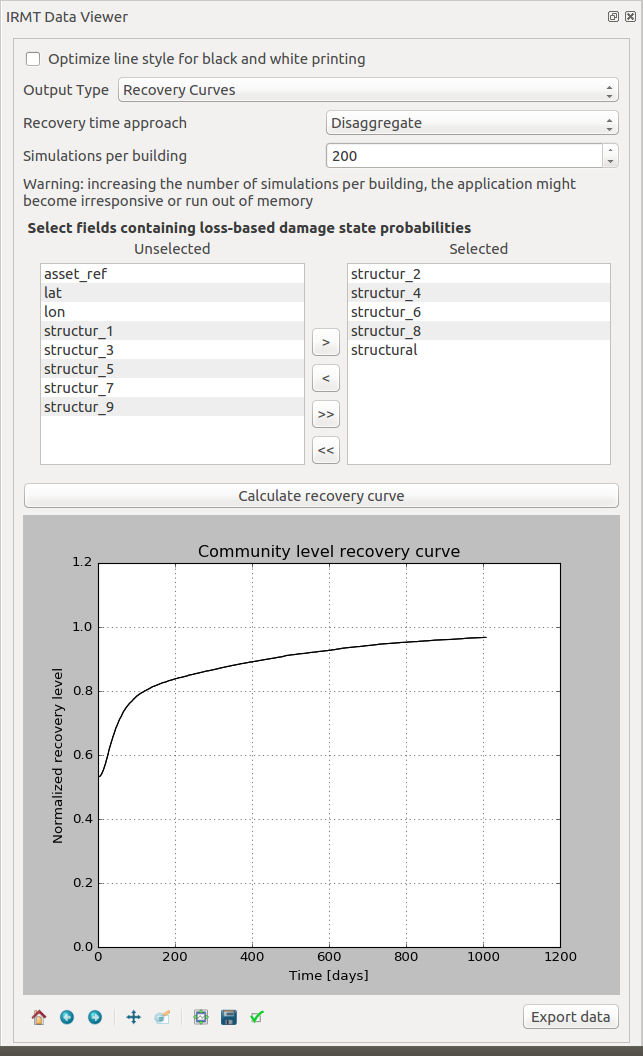
When one point is selected in the map, the corresponding building-level recovery curve is plotted. By selecting two or more points, the corresponding community-level recovery curve is displayed.
The selection can be made by clicking points directly in the map, or by leveraging other selection tools available in QGIS. For instance, it might be useful to select buildings that share a specific taxonomy. In order to do so, it is sufficient to click the Select features using an expression button in the QGIS toolbar, and to use the expression editor to perform the desired query. A useful example could be an expression such as: “taxonomy” LIKE ‘LC-%’, that would select all those features for which the taxonomy field begins with the string “LC-“, i.e., all “low building code” assets.

